Typography and typesetting form the foundation by which your whole user interface stand on. For a designer, everything else—color, art direction—is relative to the intention of the product owner. It’s very malleable. The one thing that should be unbendable is the system by which the letters are laid out on the page. If it’s not solidly built, it can grow bloated and unwieldy. Small changes that would usually take less than an hour to apply, would take double—or even triple—the development time. The size of your file can also double than how it normally would be, and that’s not good for performance. On the other hand, if it’s not the code that doesn’t suffer, it’s the legibility that takes a hit. The vertical rhythm gets compromised in ways that can easily tire the eye of the user.
There are, perhaps a hundred posts out there that talk about grids, but those things provide a horizontal guide to which elements can be laid out. The thing is most if not all, mediums are held by a user in portrait. Smartphones rest on a person’s hand in a portrait orientation by default. Newspapers are bi-folds of two portrait newsprint papers. Magazines are displayed on newsstands in portrait. Most mediums that are landscape in orientation are usually the ones that are immobile—TV, cinema, desktop—and with how things are going these days, everything is heading towards mobile. And, the ratio of portrait orientation has more space vertically than horizontally.
Vertical rhythm uses a line (baseline) repeated across the top and bottom of a media with a fixed amount of space between them to guide designers to arrange letters and provides an experience for users to consume information with ease.
There are pre-built CSS frameworks with a solid base typography already in existence that allow developers to bootstrap their projects. They provide a good starting point, but there are still things that can be done to make it more developer-friendly.
One of the most overlooked thing about CSS is actually the first word in that acronym: cascading. By layman’s term, it means that things are passed on in a waterfall effect. From the font-size down to the opacity, these properties gets inherited from the first element on the top of the DOM tree to the last descendant.
The Document Object Model (DOM) is an application programming interface (API) for valid HTML and well-formed XML documents. It defines the logical structure of documents and the way a document is accessed and manipulated.
—W3C
With this in mind, it would be best to leave font-size definitions to a set of variables already built into the CSS framework of choice, which most of the popular ones already have. Reuse them on ID’s and classes if these elements do need to have a specific size defined with it.
Work with the defined line-height of the framework. This is usually defined in a variable. Half it, divide it into a quarter, or three-quarters—just base the values that affect the spaces on top and/or bottom of an element on it. These may include padding-top, padding-bottom, margin-top, border-bottom, etc, so when the value of the line-height changes it gets cascaded to the other elements.
If possible, when you’re not using px values to define your font-size, use the rem unit, unlike it’s older counterpart, it is not relative to the body element, so it displays the element as you intended it to be. It’s something that’s supported by all modern browsers and gives designer better control on the text elements.
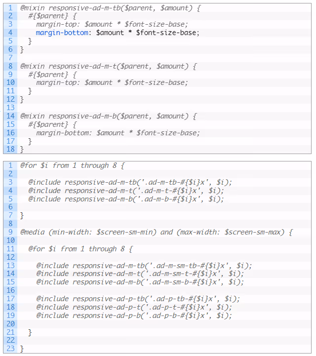
Having pre-defined classes that add vertical space to elements makes it easy for developers to lay out elements and keeps all of these spaces in line with the line-height. Creating media targetted rules that add a line, or two, or eight, or half a line, can seem simple but a very helpful thing. Using Sass, a combination of loops and mixins can be written to create these classes. The example below uses variables already built into Bootstrap.
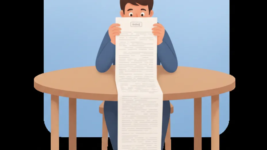
Documentation is just as important as executing the idea. They need to be clearly communicated to developers who will be working with them. It would be futile and inefficient to work with a team, and not be able to get them on board with these ideas.
There’s a trailer for a movie that will be released soon. It hinges on the idea of this quote:
If you want to fix something, you have to take everything apart, and figure out what’s important.
CSS is a very tricky design tool. It’s easy for it to grow out of proportion. Using small patches to target a small user interface bug can be quite painful sometimes. Things can fall apart inadvertently because one element is connected to a hundred others. Sometimes, the most sustainable solution is the one that requires dismantling everything, trimming out things that are repeated unnecessarily, and fixing all faulty connections.